HOW TO GUIDE
Behind the Project
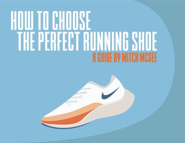
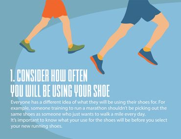
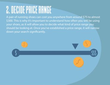
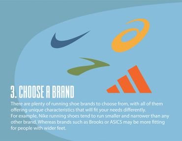
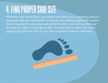
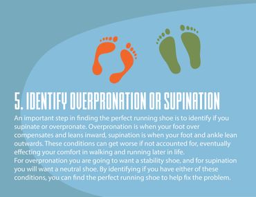
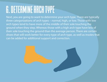
Another project in my GD 270 Semiotics class involved creating a how to guide with icons and signs that helped a viewer easily understand and complete a process. Because of my former experience and training in the shoe industry, I decided to base my guide on how to choose the perfect running shoe - a niche but also not too complicated subject that can actually make a big difference.
For my guide, I tried to base my illustrations, color palette, and other design choices on what I think a guide from a major shoe company like Nike could look like. This is why I chose a strong color palette that works well together, along with simplistic imagery and design elements that flow together to create a smooth and sleek viewing experience.
This website uses cookies.
We use cookies to analyze website traffic and optimize your website experience. By accepting our use of cookies, your data will be aggregated with all other user data.